

Last Updated: November 1, 2026
Quick Summary
To prepare artwork for garment printing, use a vector file such as AI, EPS or PDF so it scales without losing sharpness, and size it to fit the print area with a small margin. Keep lines at least 0.5 mm thick, avoid fine detail under 2 mm, and check the file against your chosen print method before you order.
- Vector files such as AI, EPS or PDF scale without losing sharpness.
- Measure the print area and size artwork to fit with a small margin.
- Keep lines at least 0.5 mm thick for reliable print.
- Avoid fine detail smaller than 2 mm in height.
- Put each screen print colour on its own named layer.
Table of Contents
- Step 1: Choose the Right Artwork File Format
- Step 2: Set the Print Size and Dimensions
- Step 3: Check Resolution and Line Weight
- Step 4: Prepare Colours and Separations for Screen Printing
- Step 5: Set Up Artwork for Heat Transfer Design
- Preflight Checklist Before You Send Your Artwork
- Frequently Asked Questions
Most artwork problems show up only after the shirts come back from print. A logo that looked sharp on screen turns blurry, a colour shifts, or a thin line disappears into the fabric. Almost all of these problems are avoidable with the right file prepared before the order is placed.
This guide walks you through six steps to prepare artwork for garment printing, from choosing the file format to checking your final preflight list, so you can prepare artwork that prints cleanly the first time.
Good artwork is not just a pretty logo. It is a file built to suit the printing method, the garment, and the size it will sit on. For a closer look at what makes a logo hold up on workwear, see why logo embroidery quality matters for workwear. Get those three right and the print comes out clean.
Step 1: Choose the Right Artwork File Format
The best file format for t-shirt printing is usually a vector file such as AI, EPS or PDF. Vector files use mathematical paths, so they scale up or down without losing sharpness.
Raster files like JPG and PNG are made of pixels (Digital Image File Formats, and When to Use them). They can work, but only at the size you save them, and they often look soft when enlarged.
Step 2: Set the Print Size and Dimensions
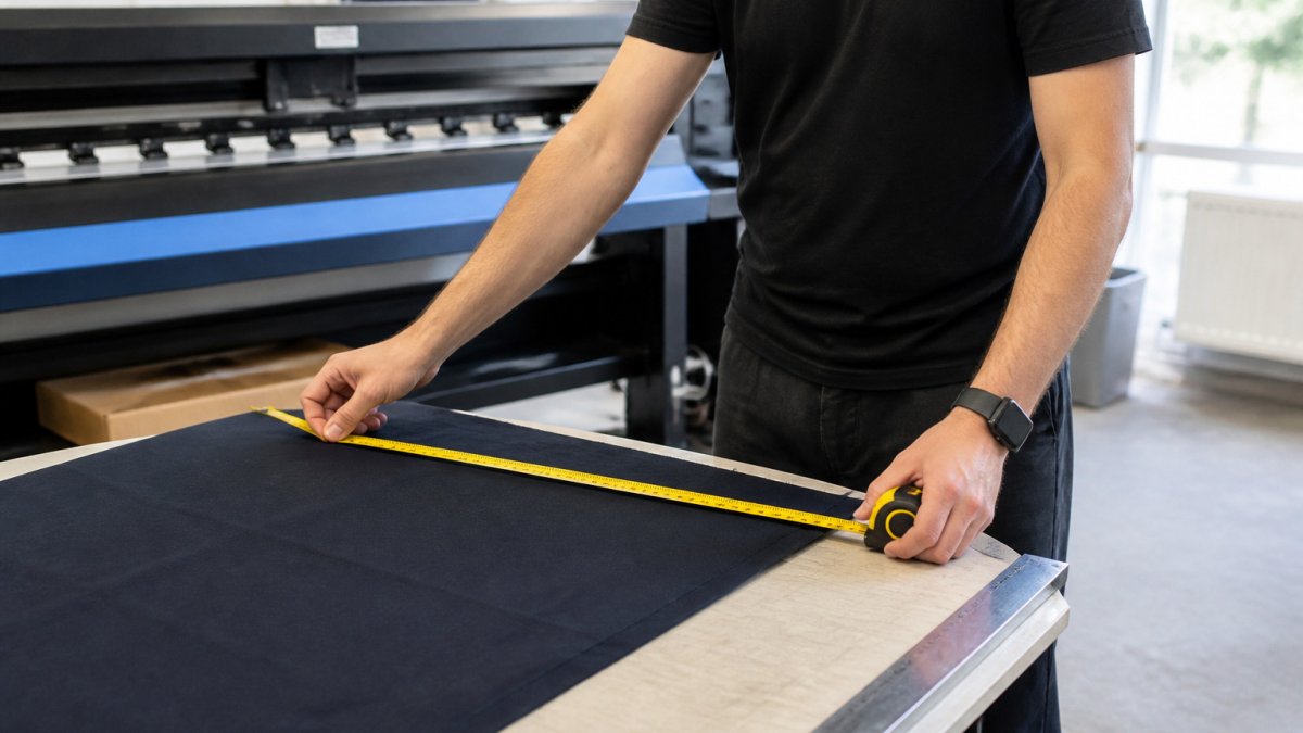
Set the print size before you finish the design, not after. Measure the print area on the garment, then size your artwork to fit inside it with a small margin.
Step 3: Check Resolution and Line Weight
- Keep lines at least 0.5 mm thick for reliable print
- Avoid fine detail smaller than 2 mm in height
- Use bold weights for small text
Step 4: Prepare Colours and Separations for Screen Printing
Screen printing is the method where colour preparation has the biggest effect on both the finished look and the unit price. Our durability comparison of screen printing and embroidery explains how the two methods differ in wear and colour handling. Each colour in your design needs its own screen, its own ink and its own pass through the press, so the way you build colour in the file directly controls set-up time and cost.
Start with the fewest solid colours that still look right
Aim for a design built from flat, solid colours rather than photographic blends. Two or three spot colours usually print cleaner and cost less than a full-colour process job, because every extra screen adds set-up time and a registration step. If a design needs four or more colours, ask whether a digital method would be cheaper at your quantity before committing to screen.
Separate each colour onto its own named layer
In your design software, place every ink colour on a separate layer and name it clearly (for example "Navy", "White", "Red"). Do not rely on the visual appearance of overlapping shapes, the printer needs to see exactly which areas take which ink. Where colours touch, leave a small trap or choke (a slight overlap or gap of around 0.1-0.2 mm) so minor registration movement on press does not leave a sliver of bare fabric between them.
Understand what RGB, CMYK and spot colour actually mean here
- RGB is how your monitor shows colour. It is not a print specification and will not match fabric.
- CMYK is a four-colour process build. It suits photographic work but on screen print it means four screens and can look muddy on dark garments.
- Spot colour is a single pre-mixed ink, often matched to a physical swatch. This is the most reliable route for brand colours on screen print.
Plan for the garment colour and the underbase
Fabric is not white paper. Printing a light colour onto a dark shirt usually needs a white underbase layer first, otherwise the shirt colour shows through and shifts the ink. That underbase is an extra screen and an extra pass, so a design that looks like two colours may actually be three on press. Confirm the garment colour before you finalise the file, and ask whether your chosen colours need an underbase, it changes both the look and the price.
Keep a separate file for other methods
- Limit the design to the fewest solid colours that still look right
- Put each ink colour on its own clearly named layer
- Add a small trap where colours meet
- Supply a Pantone or physical swatch reference for brand colours
- Confirm the garment colour and whether a white underbase is needed
- Keep a separate, correctly set-up file for each print method
The table below summarises the key colour choices for screen printing, drawn from the steps above.
| Colour choice | Effect on print | Note |
|---|---|---|
| Fewest solid colours | Cleaner print, lower cost | Each extra colour adds a screen |
| Two or three spot colours | Usually cleaner and cheaper | Avoid four or more where possible |
| Named layer per colour | Shows printer exact ink areas | Do not rely on overlapping shapes |
| Trap or choke | Prevents bare fabric slivers | About 0.1-0.2 mm |
| RGB | Monitor display only | Not a print specification |
| CMYK | Four screens, can look muddy | Suits photographic work |
| Spot colour | Most reliable for brand colours | Match to a physical swatch |
| White underbase | Needed for light ink on dark shirts | Adds an extra screen and pass |
Step 5: Set Up Artwork for Heat Transfer Design
Heat transfer is an umbrella term, and the artwork rules differ between the main transfer methods. Getting the file right for the specific process, rather than treating "heat transfer" as one thing, is what prevents a soft, cracked or misregistered print.
Match the file to the transfer method
- Heat transfer vinyl (HTV): the design is cut from coloured film, so it must be simple, with clean closed shapes and no hairline detail. Very fine lines and small counters (the holes in letters like 'a' or 'e') can tear or fail to weed. Keep lines comfortably above 0.5 mm and avoid gradients entirely.
- DTF (direct-to-film): the design is printed onto film in CMYK plus white, then pressed. It handles gradients, photos and fine detail far better than cut vinyl, but very thin white elements can look faint, so check small white text against the garment colour.
- Sublimation: the ink turns to gas and bonds with polyester, so the design must be mirrored before printing and works only on high-polyester, light-coloured garments. Colours on cotton or dark fabric will not sublimate properly.
- Transfer papers and plastisol transfers: these behave more like screen print in colour terms, solid spot colours reproduce best, and photographic blends can look flat.
Mirror only when the process requires it
Sublimation and some transfer papers require a mirrored (flipped) file because the design is printed face-down and pressed through the film. Cut vinyl and DTF are usually prepared the right way round. Do not guess, confirm with your printer, because sending a mirrored file to a process that does not need it produces backwards text on the garment.
Keep edges clean and shapes solid for cut methods
For any cut-based transfer, design for the blade. Avoid gradients, soft shadows, very fine textures and hairline strokes. Where possible, merge small separate elements into one connected shape so the film holds together during weeding and pressing. Add a small outline or bridge where a letter or shape would otherwise be an isolated island.
Check resolution and colour for printed transfers
- Keep cut designs simple, with clean closed shapes and no hairlines
- Merge small elements so the film holds together
- Mirror the file only for processes that require it, confirm first
- Use 300 DPI at final size for printed transfers
- Check white elements against the garment colour
- Confirm the exact transfer method before exporting
Preflight Checklist Before You Send Your Artwork
You can also browse our T-Shirt Customise and Polo Shirt Customise options to see how a finished design looks on the garment.


For more on keeping logos consistent across uniform orders, read our guide to Logo Consistency on Uniforms: A Practical Guide.
Frequently Asked Questions
What file format is best for garment printing?
Vector files such as AI, EPS or PDF are usually the best choice for garment printing because they scale to any size without losing sharpness.
What resolution should artwork be for garment printing?
Vector artwork does not have a resolution requirement because it scales cleanly to any size.
Should artwork be supplied as a vector file?
Yes, where possible. Vector artwork keeps lines and edges crisp at every size.
How should I prepare artwork for printing on dark garments?
Dark garments generally need a light-coloured print layer so the artwork stays visible.
