

Last Updated: November 4, 2026
Quick Summary
Choose uniform embroidery colours by checking the thread against the actual garment, prioritising logo readability while staying as close as practical to approved brand colours. Review a stitched proof on each fabric type, simplify details that lose clarity, and record the approved garment, thread shades and logo placement for repeat orders.
- Compare physical thread and fabric swatches in the lighting where staff will wear the uniform.
- Check logo legibility close up and from the distance at which colleagues would recognise it.
- Avoid relying on red and green alone to distinguish elements that must be recognised independently.
- Keep a labelled sample or swatch with the approval record for future orders.
Table of Contents
- 1. Tips for choosing uniform embroidery colours: start with the garment
- 2. Embroidery thread colour matching guide: protect brand colours
- 3. Best embroidery colours for dark workwear
- 4. Contrast ratios for uniform branding: check logo legibility
- 5. Limit thread colours and simplify embroidery details
- 6. Keep colours consistent across garments and repeat orders
- 7. Approve your uniform embroidery colours with EG Clothing
- Frequently Asked Questions
1. Tips for choosing uniform embroidery colours: start with the garment
The best tips for choosing uniform embroidery colours start with the garment, not the logo file. A thread colour that looks right on a screen can disappear against fabric or lose clarity on a textured surface. This guide from EG Clothing explains how to balance brand colours with visibility, garment choice and the practical limits of stitching.
Uniform embroidery is the use of stitched thread to apply a logo or design to workwear. The garment’s fabric colour, texture and intended use all affect how clearly that design reads. Our view is simple: readability comes first, then brand fidelity.
Start by listing the garments your team will wear, such as polos, sweatshirts or outer layers. Check each garment’s colour and texture before settling on thread. For example, the Pro RTX Piqué Polo T-Shirt is designed for embroidered logos and repeated 60°C washing, and is listed at £6.25.
2. Embroidery thread colour matching guide: protect brand colours
A useful embroidery thread colour matching guide begins with your official brand colours, then checks how those colours look as thread on the chosen fabric. Exact screen-to-thread matching is rarely the whole job: legibility and consistency matter just as much.
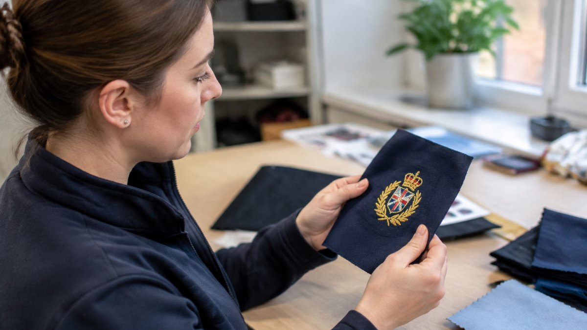
At EG Clothing, we recommend treating the logo and garment as one colour palette. Use a visual guide with the logo’s approved colours, garment colours and any acceptable alternatives. Then request an embroidery proof and check it against the intended garment before approving production.
A common mistake is to approve a colour from a digital image alone. Screens display light; thread reflects it. Ask to review available stock colours and confirm the selected shade on a sample garment where possible. If a precise brand match competes with readability, choose a clearer thread colour or adjust the garment colour.
For a detailed logo, embroidery is not always the best reproduction method. Our embroidery and printing guide explains the trade-offs.
3. Best embroidery colours for dark workwear
The best embroidery colours for dark workwear are those that remain distinct from the fabric at a glance. White thread, bright colours and selected jewel tones can stand out on dark garments, but the right choice depends on the logo and the garment’s use.
For a black or navy uniform, compare the thread against the actual fabric rather than relying on a colour name. A bright accent can improve visibility, while a close shade may blur into the garment. Pastels can work, but check that fine stitch detail remains clear.
For outdoor workwear, visibility has a practical role: a logo should be easy to identify without distracting from any required safety features. Do not assume embroidery colour makes a garment compliant. Check the garment’s stated specifications and workplace requirements separately.
The Pro RTX Pro T-Shirt, listed at £5.53, is described as suitable for embroidery or print and machine washable at 60°C. Its colour composition varies, so check the selected garment before approving thread.
4. Contrast ratios for uniform branding: check logo legibility
Contrast ratios for uniform branding are a useful way to think about how clearly a logo stands apart from fabric, but a screen-based ratio cannot fully predict how stitched thread will look. Thread sheen, fabric texture and stitch direction all affect the result, so use a repeatable sample check as well as a digital preview.
Try this practical process before approving an order:
- Compare physical swatches. Place the proposed thread card directly against the actual garment fabric, not a photograph or a colour name. Check the logo’s main colours and any small lettering separately.
- Check more than one light source. View the pairing in neutral indoor light and in the lighting where staff will usually wear the uniform. If the garment is used outdoors, check it in daylight too. A reflective thread can appear brighter from one angle and darker from another.
- Inspect at two distances. Look closely for stitch coverage and colour separation, then step back to the distance at which a colleague would recognise the logo. A design that looks clear close up may merge into the garment at a glance.
- Ask someone unfamiliar with the artwork to read it. Ask them to identify the logo and read any wording without prompting. If they cannot, increase light-dark contrast, enlarge or simplify the lettering, or choose a different garment colour.
- Repeat the check on each fabric type. Piqué, fleece and smooth jersey can make the same thread shade look different because their surfaces catch light differently.
Embroidery itself can change perceived colour. Dense stitching may cover the fabric more fully, while gaps between stitches can let the garment colour show through. Small lettering and narrow outlines are especially vulnerable to losing definition; stitch direction and thread sheen can also make a colour appear to shift as the garment moves.
Colour contrast should not be the only way the logo communicates important information. People with colour-vision deficiencies may find some colour pairs difficult to distinguish, so use differences in lightness and clear shapes or outlines as well as hue. In particular, do not rely on red and green alone to separate elements that need to be recognised independently.
The [RNIB guidance on colour and accessibility | rnib.org.uk] offers further advice on designing for people with sight loss. Treat a proof as a decision aid, not a substitute for checking the stitched result on the intended garment.
Watch out: A logo can have strong contrast in a digital proof yet become hard to read when small text is stitched onto a textured or dark fabric.
Pro RTX Piqué Polo T-Shirt, 60°C Wash →
5. Limit thread colours and simplify embroidery details
Fewer thread colours usually make an embroidery design easier to reproduce consistently. A one-colour design can suit a simple logo, while a multi-colour design may be needed for brand recognition. The right choice depends on which details must remain clear when stitched.
Embroidery has practical limits. Gradients and subtle shading do not translate like printed artwork, and tiny text can lose legibility. Simplify the design before production: remove fine details that do not help identify the brand, and ask which colours are available as stock threads.
| Design choice | Works well when | Watch for |
|---|---|---|
| One-colour design | Logo is simple | Brand detail may be reduced |
| Multi-colour design | Colours aid recognition | More colour matching |
| Solid colours | Clear shapes matter | Fine detail can still blur |
| Gradients or shading | Artwork needs tonal effects | Stitching may not reproduce them |
For complex artwork, compare embroidery with print before committing. The [UK Government’s guidance on the Equality Act 2010 | gov.uk] provides general information on accessibility duties; uniform design should support clear identification where that matters to your workplace.
6. Keep colours consistent across garments and repeat orders
Consistent uniform colours depend on recording the approved garment, thread shades, logo version and placement together. A thread that looks right on a smooth polo may appear different on fleece or piqué, and garment colours can vary between materials, suppliers and production runs. The useful step many colour guides omit is to treat the approved embroidered sample as a reference standard, not just a one-off proof.
Create an approval record containing:
- Garment name, colour, fabric type and supplier or product reference
- Logo file, approved version, size and placement
- Thread manufacturer or range, shade name or code, and colour count
- The garment and thread combination used for the approved sample
- Approval date, sample notes and any acceptable alternatives
Where repeatability matters, keep a labelled physical sample or swatch with that record. A digital image can help identify the design, but it cannot reliably show how thread reflects light or how a particular fabric affects the stitched colour.
Check each garment type separately, even when the same logo and thread codes are used. Different textures can alter stitch coverage and sheen, while a change in garment colour can reduce contrast. For a mixed uniform range, approve the combination on each fabric rather than assuming one polo proof also represents a sweatshirt or outer layer.
Care and use can also change the overall appearance. Repeated laundering, sunlight and everyday wear may affect garment colour or make a thread-and-fabric pairing look less distinct over time. Follow the garment’s care instructions, and if the uniform will be washed frequently or worn outdoors, inspect a sample after normal use before placing a large repeat order. Do not assume that a stated wash temperature guarantees that every colour will remain visually identical.
Watch out: A supplier’s shade name or code helps with reordering, but it does not by itself guarantee that a later garment batch will look identical to the approved sample.
Share the approval record with anyone responsible for procurement and keep it with the final artwork. This makes it easier to spot a proposed substitution before it reaches production and to explain what needs to match when suppliers or garment styles change. Read our advice on maintaining colour consistency and keeping logos consistent across repeat uniform orders.
7. Approve your uniform embroidery colours with EG Clothing
EG Clothing provides in-house embroidery and printing, personalised service and UK stock.
Use this checklist before approval:
- Confirm the garment style, fabric colour and intended use.
- Match thread colours to the approved brand palette.
- Check logo contrast and fine details on the garment.
- Confirm available thread colours and simplify shading if needed.
- Review the embroidery proof and approve each garment type.
- Save the final artwork, placement and colour choices for repeat orders.
The Pro RTX Ladies Pro Piqué Polo Shirt is listed at £6.58 and is described as suitable for embroidery and machine washable at 60°C. Explore our professional uniform embroidery services to discuss a branded uniform order.
Frequently Asked Questions
How do I ensure my embroidery logo is readable on workwear?
Check the logo on the actual garment colour, not just on a screen. View the sample from arm’s length in neutral lighting and confirm the lettering, outlines and small details remain distinct. Strong contrast between embroidery thread and fabric improves legibility. If fine features disappear, simplify the design, enlarge the lettering or choose a clearer thread colour before approving production.
Should I match embroidery thread to the uniform fabric colour?
Match thread to your brand colours where brand recognition matters, but avoid choosing a shade so close to the fabric that the logo disappears. Compare thread and garment samples together, then check the logo at its intended size. This embroidery thread colour matching guide approach balances brand fidelity with readability, especially when one uniform range includes garments in several colours.
What are the best embroidery colours for dark workwear?
White and bright colours can stand out against dark garments, while a brand shade can work if it remains clearly visible. Test the actual thread against the garment because a colour that looks distinct on a screen may blend into fabric. For the best embroidery colours for dark workwear, check the logo at its final size and simplify small details if they lose definition.
How many colours should I use in a professional uniform logo?
Use only the colours needed to make the logo recognisable and readable. A one-colour design can suit simple marks and is easier to keep consistent across different garments. Add colours when they carry meaningful brand details, but check that each shade is available and remains distinct from the fabric. Approve an embroidery proof on a sample garment before ordering the full uniform range.
Choosing thread colours is difficult when brand accuracy and everyday legibility pull in different directions. EG Clothing offers in-house embroidery and print, UK stock and personalised service to help you settle the design and garment choice. Get started with EG Clothing and create a consistent uniform range for your team.
